
Stock To Flow

If you aren’t aware - I am a huge fan of Bitcoin. For good reason.
If you haven’t heard of it, stock to flow is a model that you will see often in the world of Bitcoin. It is used frequently in the context of Bitcoin due to its similarities to physical gold or commodities.
Stock to Flow quantifies the asset's scarcity by comparing its existing supply (stock) to the new supply entering the market (flow).
Pay keen attention to the Bitcoin Stock to Flow chart below - if it was a Harry Potter potion, it would be:
Liquid Conviction 🧪
My approach to investing is:
Intuition first, Conviction second
Intuition is using your unique, distinct human gut assessment on a topic
Conviction is objectively measuring, gathering knowledge and backing up the intuition with numbers
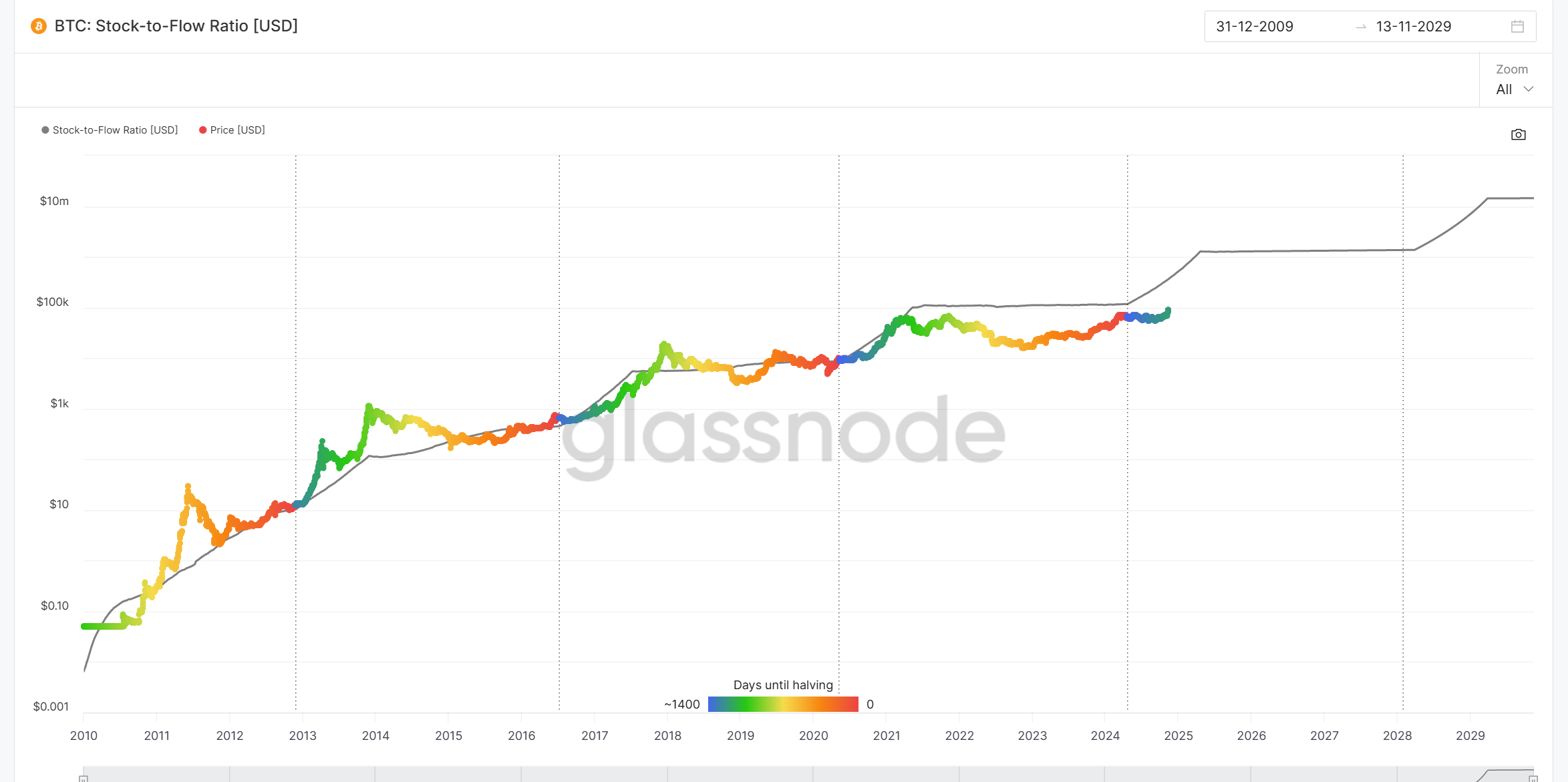
The chart above shows a logarithmic y-axis (price) and linear x-axis (time). Common logarithmic charts display increments in 10x. 100k, 1 million, 10 million, 100 million etc…
Orders of magnitude
Another word of this common logarithmic measure is an order of magnitude. Where it 10x’s each time. It can be hard for humans to visualize how large these numbers get very fast.
Some rough numbers to help you understand the mismatch between how your brain processes these numbers and reality.
I touch upon this in my other article about Entropy and the Bitcoin Brain Wallet
The chart is from Glassnode as they are a reputable data company that inspects many blockchains.
To the fresh-eyeballs, you will see a predictable pattern, up and to the right. Zooming in further you will see some stairs forming to the right.
The colored line is the historical price of Bitcoin (actual). The stair steps solid black line is the predicted price.
From foggy memory, I seem to remember the r squared value (dependent variable that is explained by the independent variable(s) in a regression model) being above 90.
Or said another way there was a > 90% correlation between predicted and actual prices.
I’ve tried to check again to see whether this has soured over the years, but have not found any recent statistics. But just looking at the chart you can see the pattern.
For a 14 year time period, the plot of the colored data points is quite remarkable.
Community Spotlight
Newsletters from other independent thinkers you might find interesting.
👉 Money Machine Newsletter, market beating stocks in a 5 min read. Picked by elite traders. Delivered weekly to your inbox pre-market!
Predictability by Design
What forces are present to mean that this chart is able to be produced and why is it so predictable? Lets look at some of the features of Bitcoin to see how it is constrained, finite and predictable.
Bitcoin is the immaculate system. Designed to be a system of self balancing rules, checks and balances.
Firstly, Bitcoin respects the laws of real world physics. Something cannot be created from nothing. Governance ensures that these defining rules cannot be broken.
The system requires real work (in the form of computation and energy) so that be magicked out of thin air. Discouraging attackers from the system. The cost of such an attack would be astronomical in modern day.
The hard constraint of 21 million total coins means that it is a finite resource emulating the “scarcity of gold” (although gold isn’t really scarce). The main pain point of Fiat currency is that it is inflationary. The money owners can give themselves wealth while stealing from everyone else. Bitcoin’s final stage design is that there is a finite cap as to the number of coins. So ultimately no more would be produced and therefore non-inflationary.
Interestingly a lot of existing coins have been lost, so the true held number of coins will be a lot less than 21 million. I’ve heard numbers such as 16 million actual coins remaining.
Whenever coins are lost, their value is distributed to all other existing coin holders. This is not part of the protocol per se, but by being out of the pool of in use coins, it empowers all other coins by that lost value mathematically.
Finally, the Bitcoin halving.
The Bitcoin halving is a programmed event that occurs approximately every four years, reducing the mining reward for new blocks by half to control supply and increase scarcity over time.
This is what you can see in the chart as a stair step up, on the right hand side of the chart.
From my observations, fiat price action occurs a year or so after the halving. At the time of writing, we are about 65% (at a guess) through that bull cycle.
